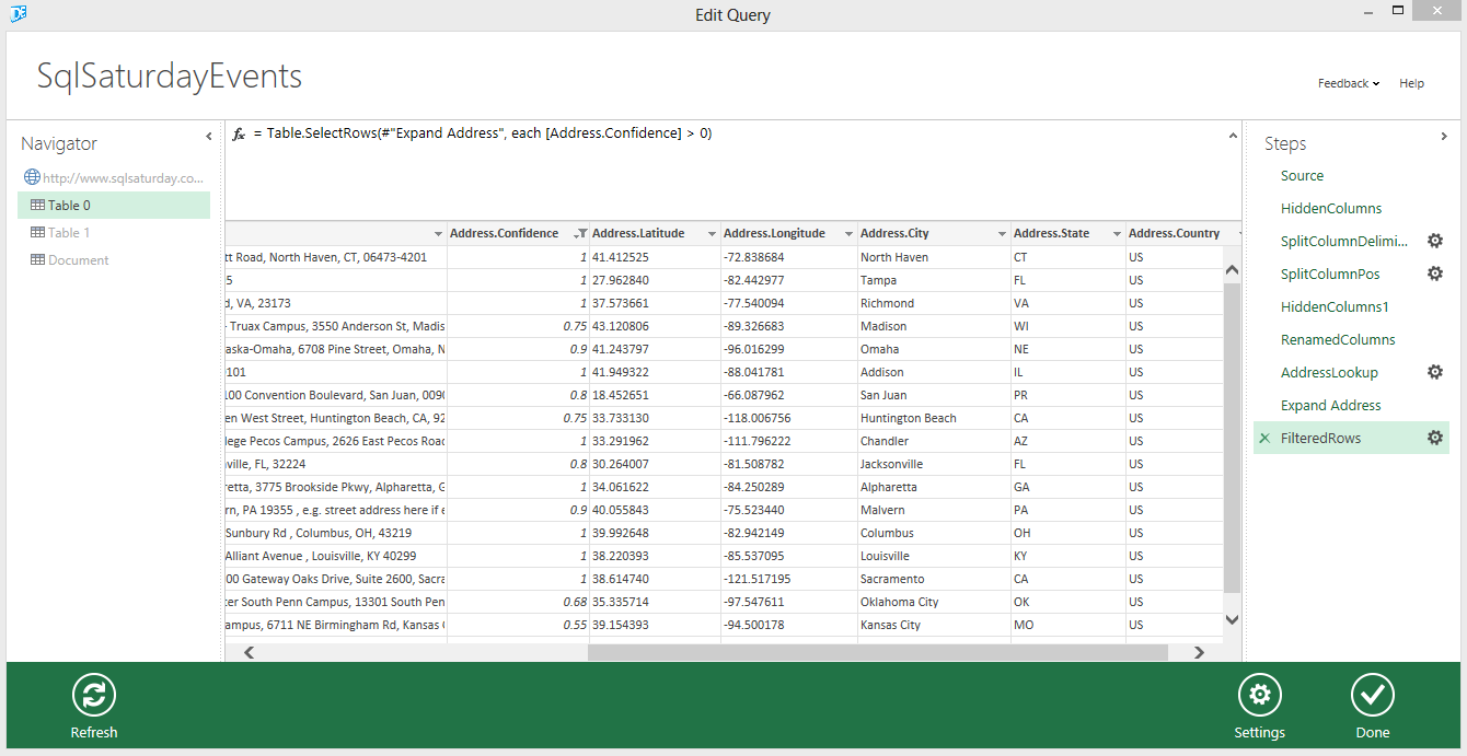
In my first Data Explorer post, I pulled a list of event data from the SQL Saturday website. I then showed how to do dynamic lookups against an address verification service to pull back location data about the event’s venue. In this post I’ll complete my experiment and plot out each location on a map so I can easily see how far away each event is.
I’ll start off with the data I had from my previous post. Within the data, we have Latitude and Longitude values which we will use to create our location map with Power View.
The first thing we’ll do is create a Data Model in Excel. We do this by selecting our data, and clicking on the Add to Data Model button on the POWERPIVOT tab.

This brings up the PowerPivot window, with all of the columns from the Data Explorer query. 
The Address.Latitude and Address.Longitude columns are currently set as General/Text fields. We’re going to change this to Decimal Number by selecting the columns, and changing the Data Type field.

On the Advanced tab, we’ll set the Data Category values to Latitude and Longitude. This allows the columns to be automatically classified when we’re plotting our data.

Some other settings that will make visualization easier would be:
- Setting the appropriate category values for City, State and Country
- Fixing the “Summarize By” setting for Confidence, Latitude and Longitude
Once we’re done updating our data model, we can close the PowerPivot model and insert Power View report.

Select the fields we want to use in our report.

Select the original table it put in our report, and click the Map button to convert it.
The default categorization of the columns didn’t really make sense, but we can easily change that by dragging the fields around to where they belong.

Voila! In just a few minutes, we have a chart that maps our events across the US.

1 thought on “Using Data Explorer with Power View”
Comments are closed.